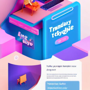
In the vast expanse of the internet, error pages are often seen as the dead ends of the digital highway. Encountering a 404 page can be a frustrating experience for users who find themselves wandering off the familiar path into error territory. However, what if we told you that these misunderstood destinations could be optimized to enhance user experience and even convert lost visitors into happy customers?
Understanding 404 Pages
A 404 page is what users see when they try to access a broken or non-existent page on a website. Originally designed to simply indicate that a requested resource was not found, 404 pages are now being leveraged by savvy businesses to capture user interest and keep them engaged.
Why Optimize Your 404 Page?
While it might seem counterintuitive to invest time and resources into something associated with errors, optimized 404 pages serve multiple purposes. Not only do they help retain customers by guiding them back to the functional areas of your site, but they also present a unique opportunity to reinforce brand identity and personality.
Retaining Lost Traffic
An effective 404 page redirects users back into the flow of your site, reducing bounce rates. Including navigation menus, alternative suggestions, or a search bar can significantly enhance the user experience by quickly directing them to valuable content.
Reinforcing Brand Identity
A 404 page is another touchpoint between your brand and your audience. Incorporate elements such as your brand’s logo, colors, and tone of voice. Some companies even infuse humor or creativity into their 404 pages to leave a lasting impression.
Driving Conversions
Well-crafted 404 pages can contain calls to action (CTAs) that promote sign-ups, offers, or other actions you wish users to take. Adding links to popular products or content can guide potential customers toward conversions, transforming a negative experience into a profit-driving one.
Essential Elements of an Optimized 404 Page
To ensure your 404 page is a valuable asset, a few elements are key.

Clear Messaging
Clearly state that the page is a 404 error, but do it in a way that aligns with your branding. Avoid technical jargon and opt for user-friendly language that recognizes the user’s frustration while offering a solution.
Navigation Options
Incorporate links to your homepage, a search bar, or top site destinations. This helps users find their way back to relevant content quickly and easily.
Engaging Design
Ensure the page is visually appealing and consistent with the rest of your site. Images, graphics, or animations can soften the blow of landing on an error page.
Contact Information
Provide users with a way to contact you if they need further assistance. Offering support can help maintain a positive user experience and show visitors that you care about their journey on your site.
Conclusion
Ultimately, optimized 404 pages are about turning missteps into opportunities. A strategically designed 404 page not only enhances the user experience but also keeps your audience engaged, paving the way for potential conversions and long-lasting customer relationships. So next time you revamp your website, consider giving these overlooked pages the attention they deserve. The result? Happier users, improved retention, and a more agile and responsive brand presence in the digital landscape.


